Side projects
Things I redesign on my own time.
Games are where I first started caring about interfaces, so that's where most of my side work goes. Each of these starts with something that bugs me as a player and ends with a design I'd be comfortable handing to an engineer.
01 · Game UI concept · Solo, 2026
A HUD that knows when to step back
A heads-up display for Ashen Vale, a third-person action game I made up so I could design its HUD. It shows what the moment calls for and stays out of the way the rest of the time.
Ashen Vale is fictional. The key art was AI-generated for this concept. The UI on top of it is mine.
Why I'd build it this way
Most big action games now let you switch HUD elements on and off one at a time. The Last of Us Part II and God of War Ragnarök both do. A few go further and manage the HUD for you. Horizon Zero Dawn can fade it out and bring it back with a swipe on the touchpad.
What you can't see from the outside is the rules behind a dynamic HUD: what brings an element on screen, what keeps it there while you're exposed, and what the player can override. Those rules usually live in internal specs. Mine are laid out below.
Every marker has a shape as well as a color. A chevron is always a melee enemy, a diamond is always an archer and the objective is a pin, so players who can't tell red from amber still read them. They can pick their own colors too.
I checked text contrast against the real pixels behind it, with drop shadows off. It clears 4.5:1, or 3:1 at 24 px and up. Markers, icons and the threat ring carry a dark backing or halo, which keeps them above 3:1 on any part of the scene. Subtitles and objective titles meet the Xbox guideline of 26 px at 1080p. Smaller HUD labels and the 24 px menu text don't at the default size, so HUD scale goes to 200% and a Menu text size setting under Accessibility goes to 36 px.
Four moments, one scene
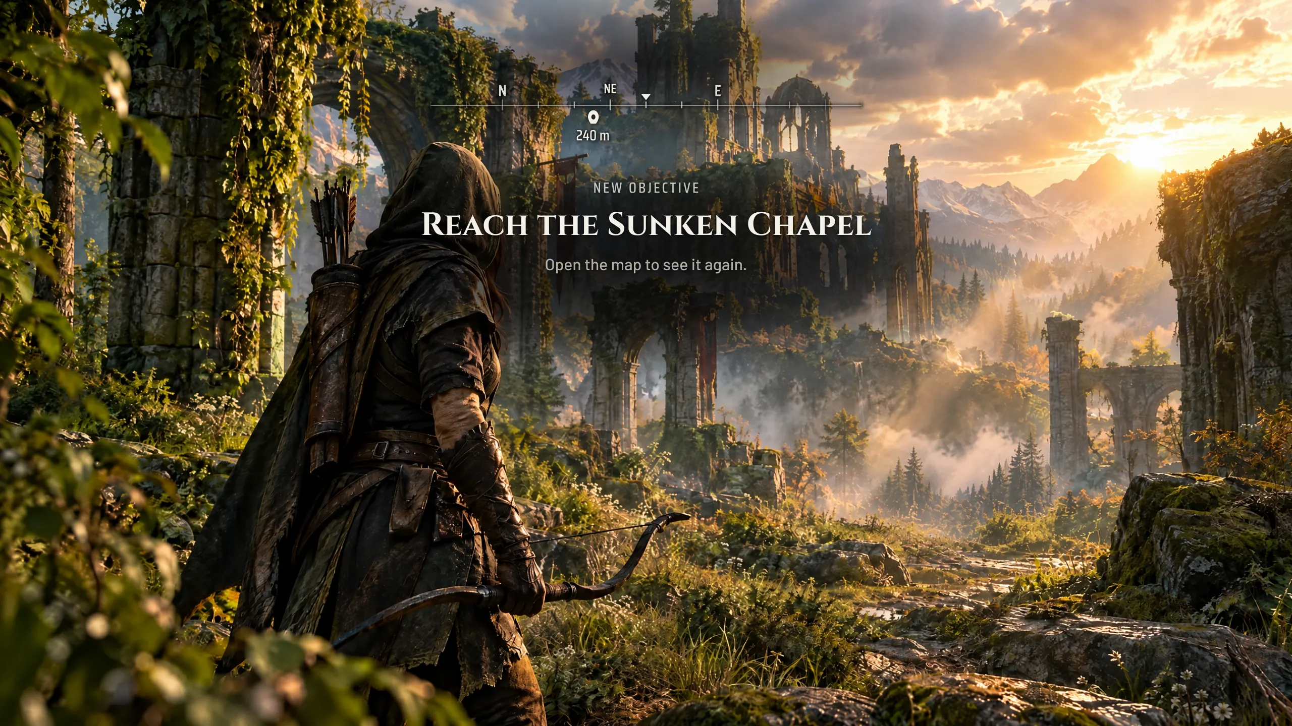
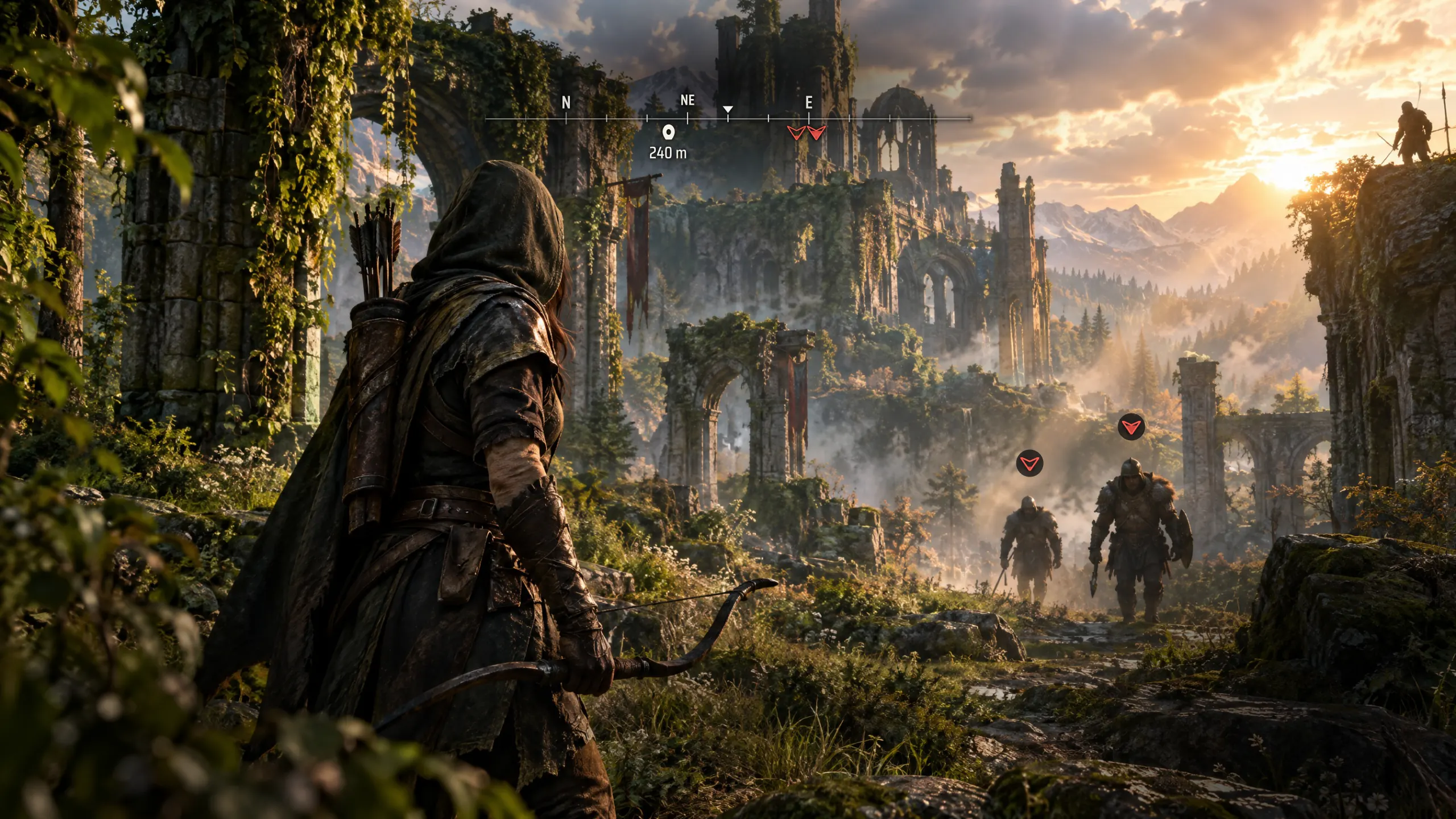

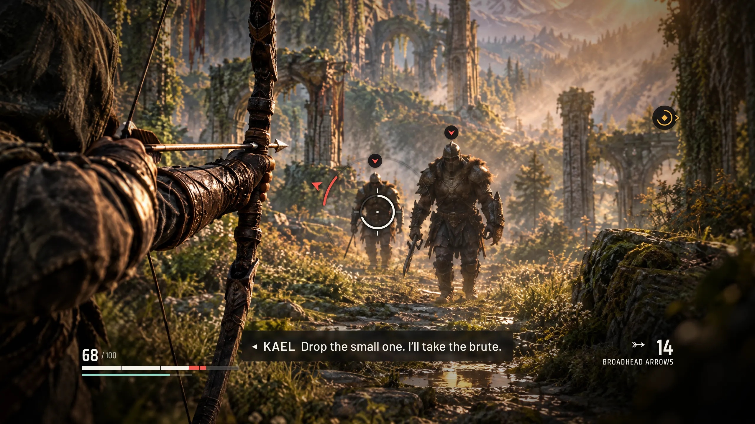
When the HUD changes
| State | Starts when | Ends when | On screen |
|---|---|---|---|
| ExploringDefault | No enemy is searching for you or aware of you | An enemy hears or spots you | Compass. A new objective shows once, then hides. |
| Searching | An enemy hears you and starts looking | They give up, or one spots you and it becomes Combat | An outlined marker over each searching enemy and on the compass. It fills from the bottom as they get closer to finding you. |
| Combat | An enemy spots you or hits you | 6 seconds after the last enemy loses track of you. If anyone is still looking, it drops to Searching. | Compass, ammo, threat markers and the locked target. Health and stamina follow their own rules. |
| AimingLayers on any state | You hold aim, in a fight or out of one | You let go | The draw meter and ammo join whatever is already up. The compass and target plate hide. |
- The state follows what enemies know, not what you're holding. Drawing the bow shows ammo but doesn't start a fight.
- Health shows while you're below 50% and for 4 seconds after any hit, in any state. A fall or a fire brings up health but doesn't start a fight. Stamina shows while it drains or refills.
- Subtitles and captions ignore HUD state and mode. They follow the dialogue and their own settings.
- Elements fade in over 150 ms and out over 400 ms. The short fade-in means a hit shows up at once. The longer fade-out keeps the screen from flickering when a fight stops and starts.
- Tap the touchpad, View on Xbox or H on a keyboard to bring up every element that isn't set to Off for 5 seconds, in any state.
The settings screen
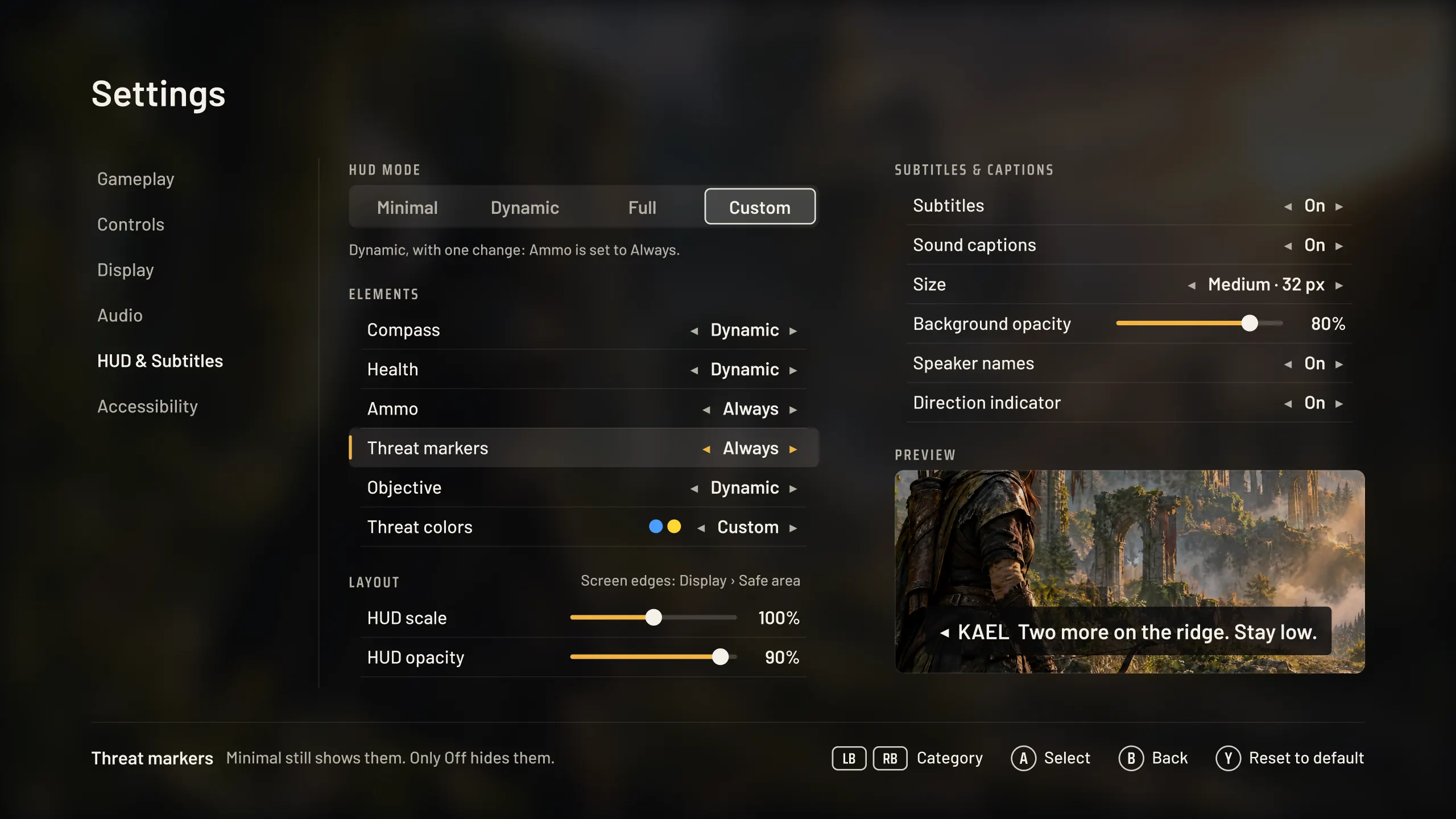
What each mode starts from
| Element | Minimal | Dynamic | Full |
|---|---|---|---|
| Compass | Off | Dynamic | Always |
| Health | Dynamic | Dynamic | Always |
| Ammo | Off | Dynamic | Always |
| Threat markers | Always | Always | Always |
| Objective | Off | Dynamic | Always |
- Any element can be set to Always, Dynamic or Off. Changing one switches the mode to Custom.
- For threat markers, Always means whenever an enemy is searching for you or aware of you.
- Threat markers covers the overhead, edge and compass markers, the threat ring and the target plate. Stamina follows Health.
- At larger HUD scales each element grows from its own corner, and subtitles move up to clear the health bar.
How it's laid out
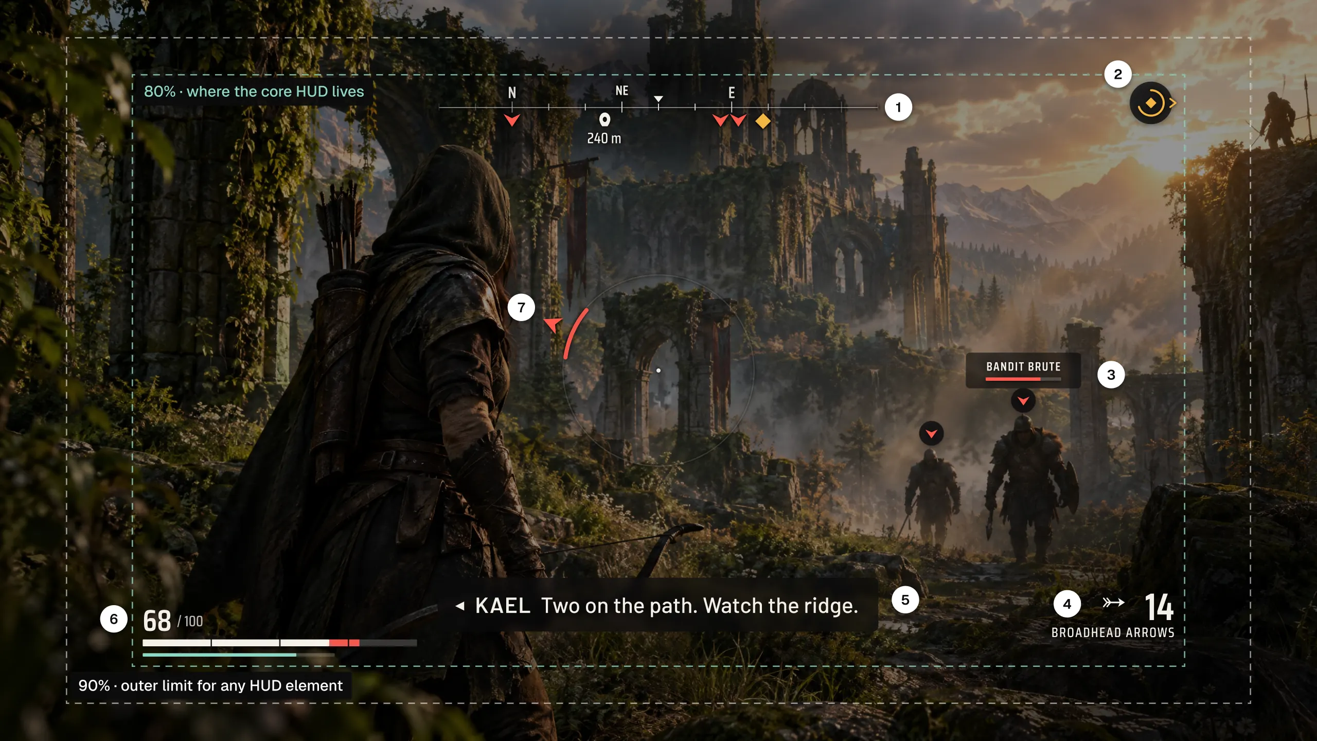
- 1. Compass
The objective pin and enemy directions share one line, so there's no minimap to check in the middle of a fight.
- 2. Archer wind-up
The ring fills as the archer draws, which gives you a beat to dodge. Past the 80% line, on screen or off, the marker holds at that line with a caret pointing to the enemy.
- 3. Locked target
Name and health sit on a dark plate so they stay readable against a bright sky.
- 4. Ammo
The number you check under pressure, so it's the largest one on screen.
- 5. Subtitles
Speaker name and direction, 32 px at 1080p, 40 characters a line at most, on a plate the player can make darker.
- 6. Health
Notches every 25% and a red chip for the damage you just took, so the bar reads without the number, which players can turn off. The thin teal bar under it is stamina.
- 7. Threat ring
An enemy you can't see, here one flanking from the left, lights up a segment of the ring around the crosshair on the side the hit will come from.
- Type
Saira Condensed for numbers and labels, Barlow for sentences. The serif only appears for story beats, like a new objective, so they never look like system text.
Considered and dropped
- A minimap
It shows where everything is, but it pulls your eyes to a corner in the middle of a fight. The compass gives direction without leaving the center of the screen.
- No health bar at all
A fully diegetic HUD looks clean, but players shouldn't have to guess how close they are to dying. Health hides when it's high and stays when it isn't.
- Color-only threat markers
Red for melee and amber for ranged would be enough for most players. About 1 in 12 men have some form of color blindness, so every marker got a shape.
Influenced by Horizon Zero Dawn's dynamic HUD, the guiding wind in Ghost of Tsushima, and the accessibility menus in God of War Ragnarök and The Last of Us Part II. Safe areas follow SMPTE ST 2046-1. Text size and contrast follow the Xbox Accessibility Guidelines, XAG 101 and 102.
02 · Store UX concept · Solo, 2026
Buying a game on Steam in one decision
A rework of the purchase area on a Steam store page, built around three things people tend to check before they pay: which edition, whether the price is good, and whether the game will run.
Unofficial concept, not affiliated with Valve. The game on the page is the same made-up Ashen Vale.
Before and after
Why I'd change it
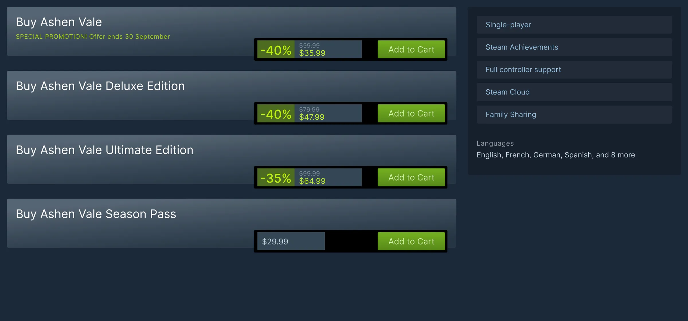
When a game on Steam comes in editions, the store page shows a stack of buy boxes that each repeat the title, the discount and the price. To see what an extra $12 gets you, you scroll down to a description. The system requirements are further down still, in a block of text you check against specs most people don't know offhand.
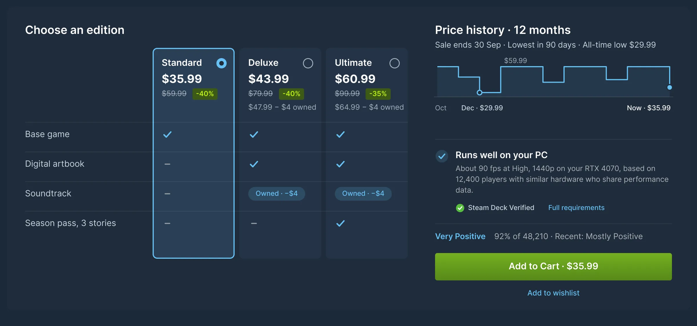
This concept puts the purchase on one panel. Editions sit side by side, so the differences line up and you can scan them. Steam bundles already take off the price of anything you own. Editions sold as separate packages don't, so a player who bought the soundtrack pays for it twice. Here it's credited at the soundtrack's current price, $4 this week. Publishers would have to set their editions up as bundles for this to work, so it's a store change as much as a UI one.
The price comes with context: a year of history and the all-time low. Sites like SteamDB and IsThereAnyDeal exist because people want exactly this. In the EU a discount already has to be measured against the lowest price from the previous 30 days, so Steam tracks some of this data today. For performance, instead of asking you to read requirements, the panel estimates how the game runs on your hardware, based on players with similar PCs who chose to share their data.
Trade-offs
- Standard is preselected
It's the cheapest way in, and a picker that opens on the priciest edition reads as a trick. It may lower the average order. I'd accept that if more visitors buy at all.
- Price history can make people wait
Some players will see the all-time low and hold out for the next sale. Many of them check SteamDB anyway. Showing it here means they wait on Steam, with a wishlist sale alert, instead of on SteamDB.
- Publishers may not want the low shown
An all-time low on the page can hold back full-price sales. History would only appear during a sale, and only after a game's first 90 days, so launch pricing isn't undercut by its own chart.
What I'd measure
| Metric | Role | Expected |
|---|---|---|
| Purchases per store-page visit | Primary | Up, from one clear choice and fewer trips to other sites |
| Revenue per visitor | Guardrail | Holds, even if the average order drops |
| Wishlisted games bought within 30 days | Guardrail | Holds, so price history isn't just delaying purchases |
| Refunds citing performance | Secondary | Down, because buyers know how it will run before they pay |
| Deluxe and Ultimate share of sales | Secondary | Watch it. Preselecting Standard pulls it down and the owned-item credit pulls it up |
Edge cases
- No performance data yet
New releases and rare hardware fall back to the minimum and recommended specs, checked against your PC, with a plain note that it's a spec match and not a measurement.
- You already own the base game
The columns switch to upgrade prices. For this viewer, who also owns the soundtrack, Deluxe is an $8 upgrade and Ultimate is $25, with the same math line under each.
- Only one edition
The columns go away. You get the price, its history during a sale, the performance line and the button.
- Browsing on a Steam Deck
The estimate uses Deck players' results and leads with the Deck Verified rating.
- Sharing is opt-in
Estimates only come from players who chose to share, and the panel shows how many that is so you can judge it.